20 Apr The state of in-car UX: it’s getting worse, and more technology is not the fix. Voice is.
Geoff Teehan of Toronto’s exquisite design firm Teehan+Lax recently posted on “The State of In-Car UX.”
.@gt Wouldn't you like to propose some visuals? Isn't the future HUD & voice & minimal interior? Room for indie when Apple & Google dive in?
— Noah Bloom (@nbloom) April 10, 2014
It’s wonderfully visual and a worthwhile read, but still if you want a tldr: Teehan argues that no matter the price or the brand, the interfaces that adorn today’s vehicles are in a bad place. And they’re getting worse. Thankfully, there’s hope. Hope coming from Apple and Google.
Remember this? 1995 Nissan Pathfinder with aftermarket stereo:
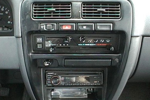
1995 Nissan Pathfinder
Now, for $845,000 in the otherwise luscious Porsche 918 Spyder, you get this. Really?
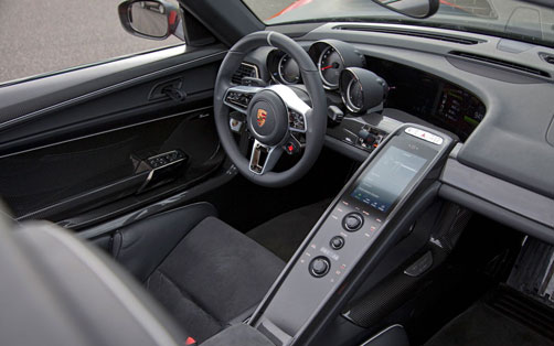
Big and obtrusive and distracting.
Is this really the UI people are raving about in the Tesla Model S?
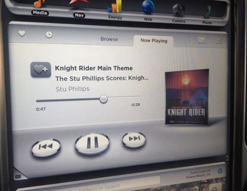
Tesla S: still too much going on visually
Pretty galling especially to see Lambo and Ferrari electronics UI.
And in a $1.5M Lamborghini Reventon — what does it all mean? And that it often gets worse as the car gets more expensive.
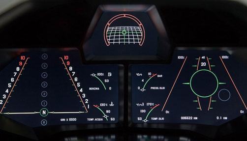
Lamborghini Reventon — what does it all mean?
Jalopnik chimed in this week in “This Is The Worst New Trend In Car Interior Design”
While touring the cars on display at the New York Auto Show, I was struck by how many of them get the integration of a screen into the dash right and how many of them get it wrong. If the screen is going to be a part of the car, shouldn’t it be integrated seamlessly into the design of the dash, rather than plastered on like a cheap Garmin you bought at Walmart?
An afterthought design earsore?
The argument here is that: it’s only getting worse. The bright effort to slide your (familiar, better designed, fully functioning) iPad Mini onto the dash never seemed to have too much uptake. Car companies don’t hire or use people who design software for a living to conceive of and build the UX. Stereos, climate control, etc are designed either by industrial designers, car designers, or Human Machine Interface, which is what the car industry calls the people who deal with knobs and dials.
What’s next? Teehan harks on the arrival of Google and Apple CarPlay. Apparently, these software plus hardware giants are the panacea. And their placement of the buttons on the touch screens will solve our woes. While it seems reassuring at first, this is really no improvement.
I actually think this upcoming entrance of better software (via Google and Apple) into car UX is only a temporary stop-gap. In 10-15 years, cars (nicer cars) will (should) have super simple and many less controls. Like how Audi puts climate controls directly on the vents.
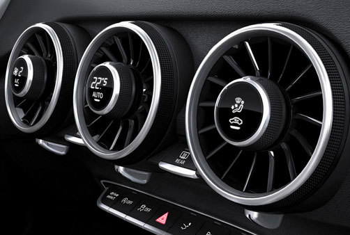
Audi: Control built into function
Your interactions will be all via voice and basic Head-up Display. HUDWAY reflects a simple UI from your phone onto the windshield. Here’s your inspiration:
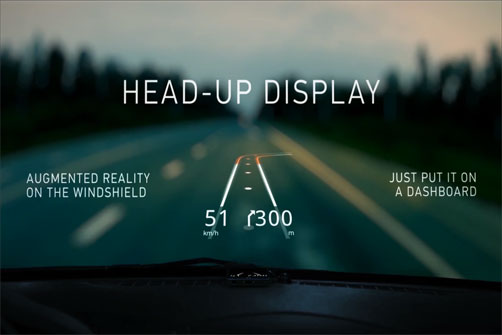
Clean HUD concept from HUDWAY
So, without all the clutter of current software offerings, the (better car) interiors will be back to classic, no frills looks — like my dream Porsche 356, beautifully simple and minimalist:
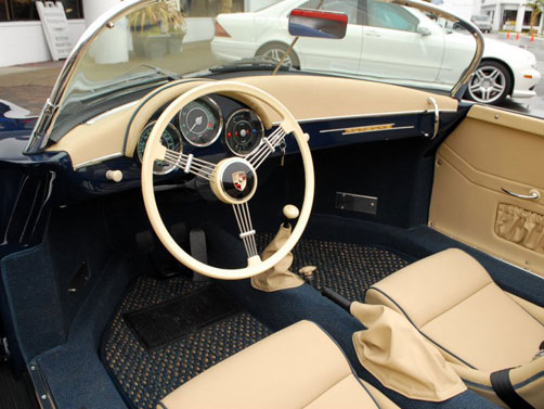
Porsche 356 cockpit; beautifully simple and minimalist
Summary: it’s easy to get caught up software-ifying the world and everything. Sometimes, especially when doing dangerous things like driving, the less interaction and the less design the better. The solution is not the smart and brash Apple and Google swooping in to fix the issue. The solution is voice-activated control, and maybe even HUD (Head-up Display) for navigation, and focusing on the driving part. At least until we’re all in driverless cars — 25 years away?
Dan Reitman chimes in with this great rant:
Colin Chapman, founder of Lotus cars, famously said “Simplify, then add lightness.” Of course, he probably didn’t consider Moore’s law, nor The Law Of 7-11 (Thine steed shall contain a cup-holder big enough to hold a Big Gulp). Cars would invariably get heavier and more complicated. This did not make for a better, safer driver – which should be the priority – nor does what Teehan is proposing.
He talks a lot about design purity and aesthetic beauty. He is an expert. Unless I missed it, he doesn’t, however, talk about ergonomics – and I wonder if he knows anything about them. To wit: how is a more pleasing font in a Porsche 918 infotainment screen going to improve my lap time or keep me from making sweet, violent, carbon-fibre love to a telephone pole at 100mph?
When I’m barrelling down the highway, I give precisely zero fucks about the fonts on my stereo screen. I care about how well I can feel around for the A/C controls (3 physical dials FTW, touchscreen = FAIL) or the volume knob, and where the flappy paddles are.
Teehan may like cars, but I bet you he’s just like the rest of the world’s distracted drivers: clogging the left lane while fiddling with his smartphone. The fact that he thinks any kind of swipe gesture is a remotely sound ergonomic choice for a car hammers this home.
This leads to a bigger issue about how we use our cars. I get that driving habits are, of course, a regional thing. I was just in LA for a couple of days and was reminded how bad the traffic was there – Jeff, i am guessing the Bay Area is just as bad. California is also, of course, a massive car market. If i lived in those places and had a commute that regularly involved me stuck in crawling traffic, I would likely be interested in things like in-car internet and other infotainment options that were optimized – both aesthetically and functionally – for my use, as Teehan describes.
The other side of the coin is those who believe that driving, whether on the Autobahn or in a gridlock traffic, is an activity that should involve minimal distraction and interference from other pursuits. Drivers should be focused on moving as quickly and safely as possible (and stay the out of the left lane) until they reach their destination, at which point they can start surfing the web or doing whatever else they need to do. Drivers in Europe seem to have this one figured out pretty well.
TL; DR – Teehan is barking up the wrong tree, IMHO. He’s pushing for improving in-car UX as it applies to infotainment – but the car is not yet an appliance; those things are secondary, and if they aren’t treated as such, we’re just going to have more distracted drivers who are a nuisance and hazard on public roads. Build me an interior that focuses on driver alertness, safety, and comfort – in that order – and worry about turning your car into a Bang & Olufsen or Apple showroom when the thing is parked.
Less and smarter technology, more voice activated features. Less distraction, more safe driving. Less buttons, more classic clean design. What are your favourite car interiors free of design clutter?